

What's New | A Fresh Look for Summer
We want to share some exciting developments.

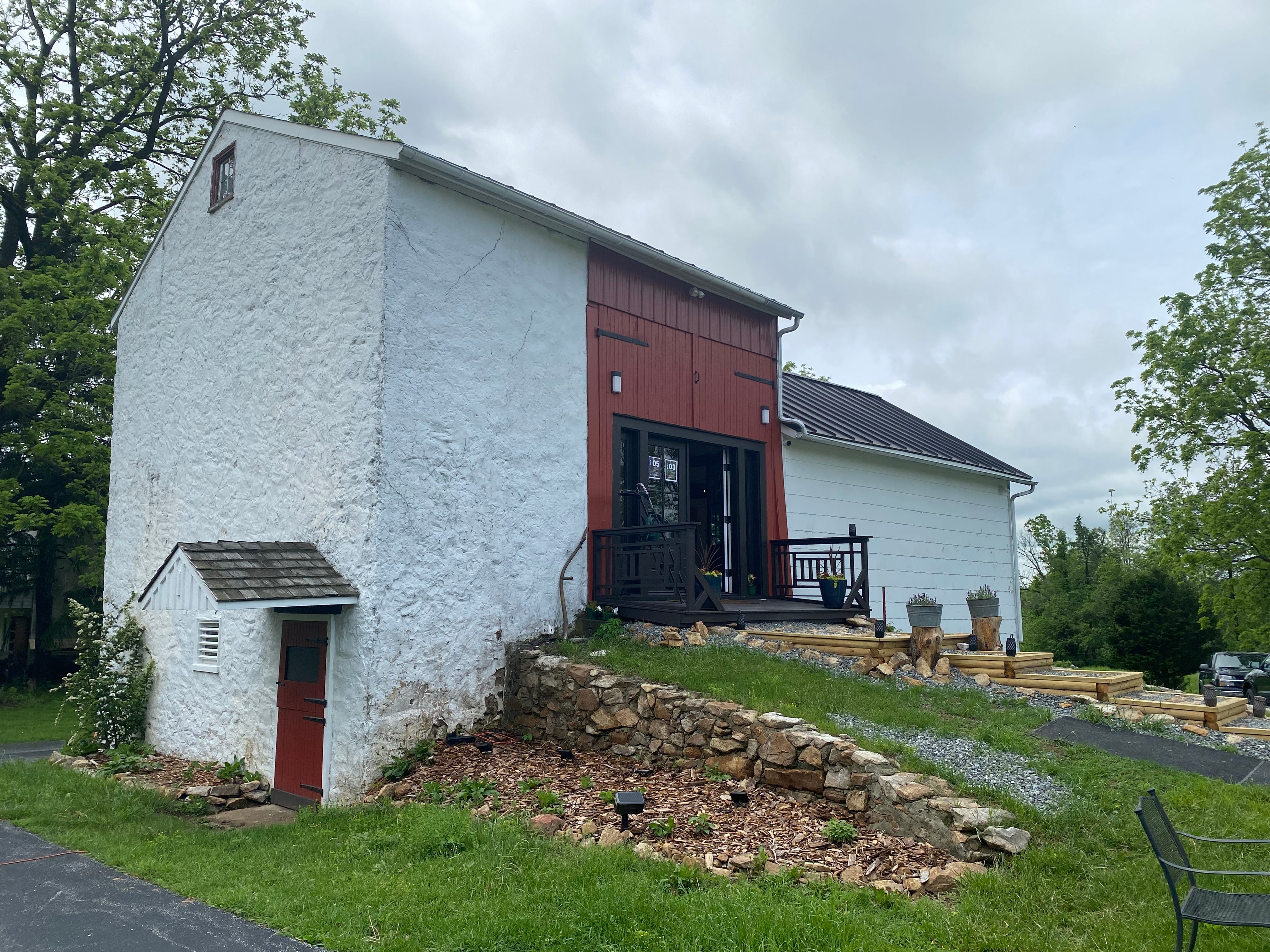
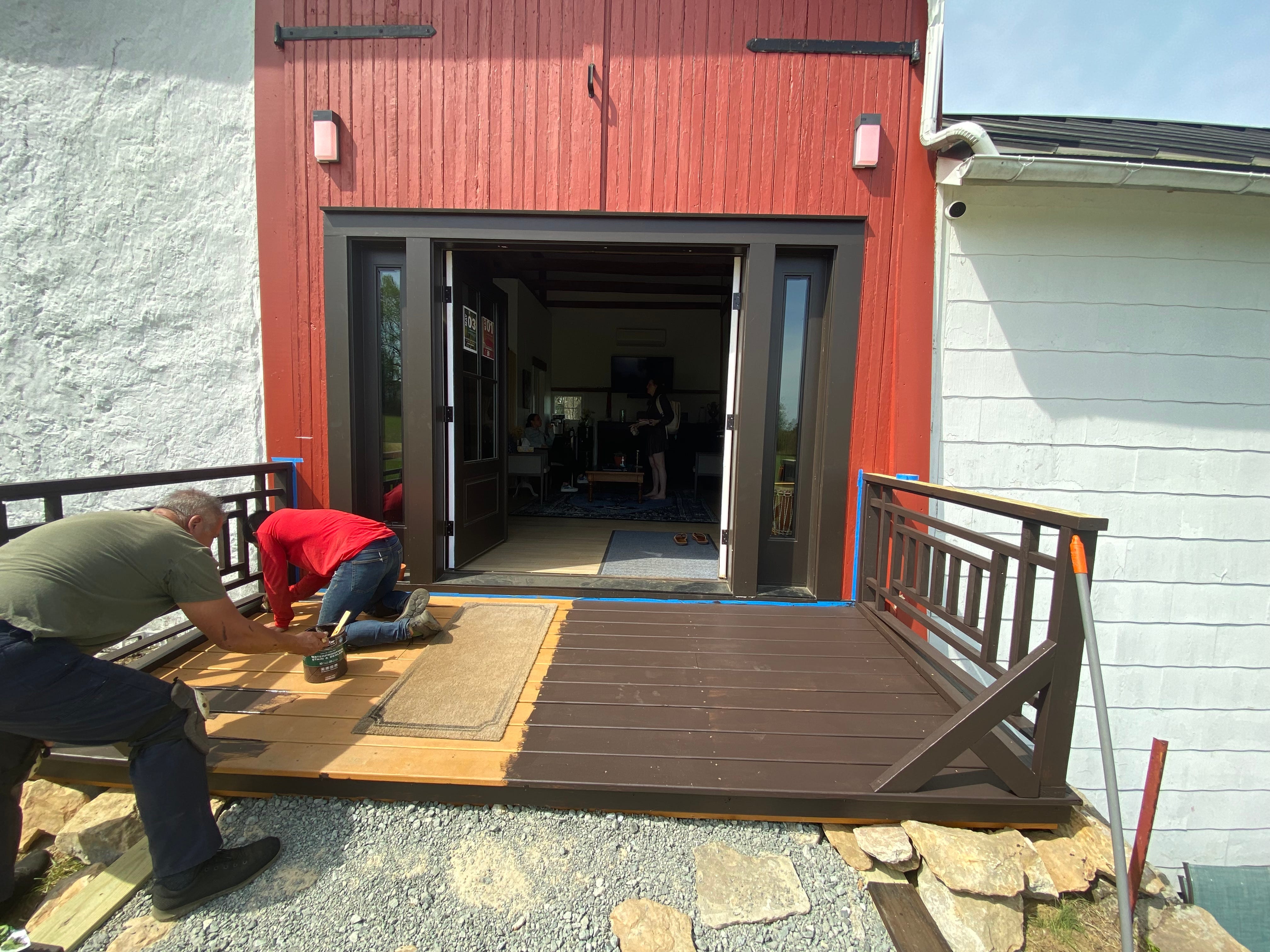
Over the past couple of months, the Longview Farm has received some upgrades!
The person spearheading these additions is Patrick Seyler.
Patrick has been a long-time supporter of the farm and friend of the owners, but he recently joined the team in an official capacity. He works alongside Jessi Stead and Land Manager, Ricky Eller, to conceptualize and design projects that enhance our visitor experience through functionality and aesthetics.
Patrick’s practice includes the 3-6-9 method and the Fibonacci Sequence to achieve balanced proportions. As an example, he makes things that contain numbers with metaphorical meaning.


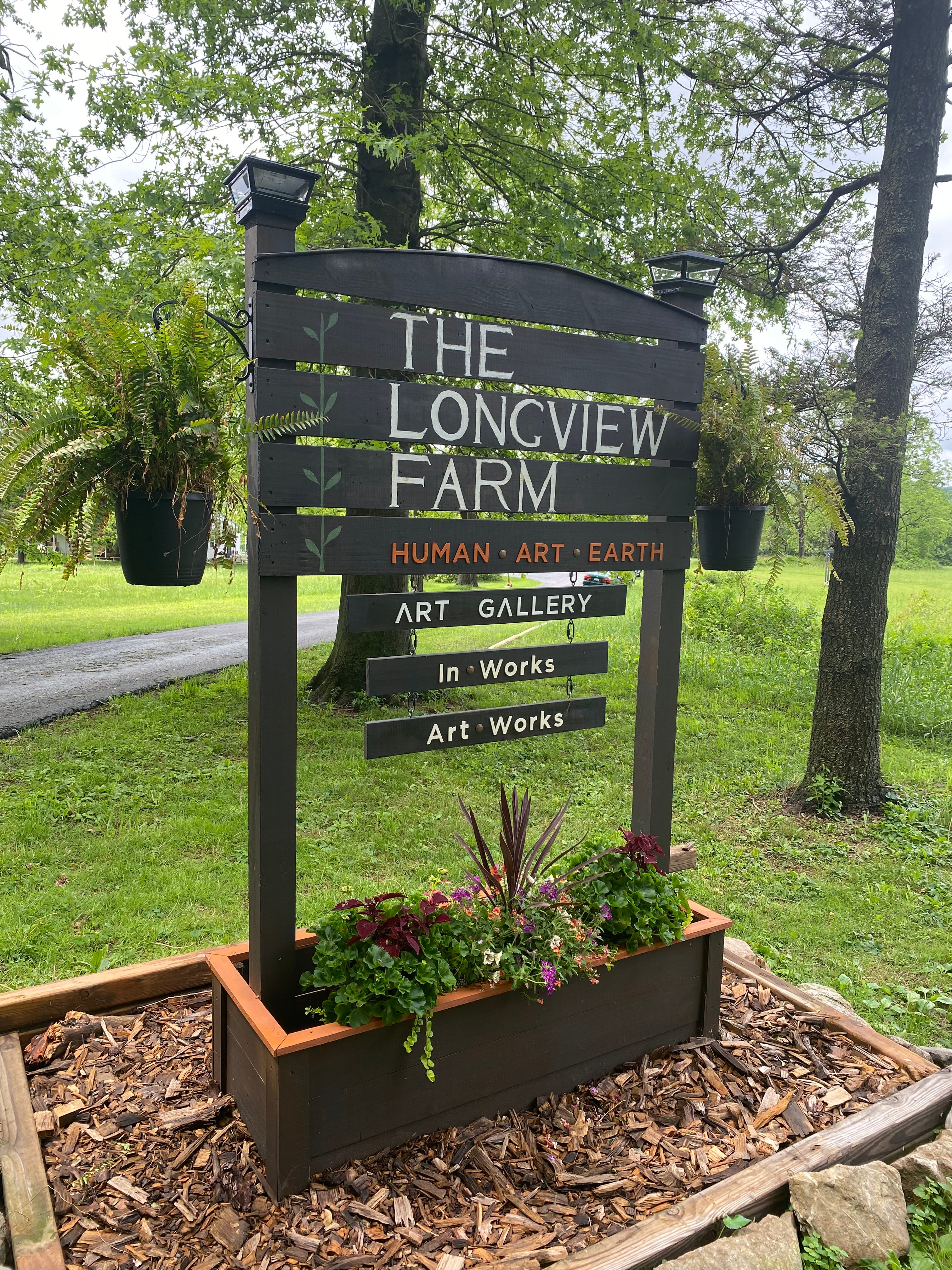
The new stairs elevate the overall look of the property and invite visitors to enter the barn. Similarly, The Longview Farm sign lets visitors know they are in the right place before turning into the driveway.
Patrick built a sign based on The Longview Farm’s type logo. He carved a house number for the mailbox and arranged the surrounding land, using woodchips from the farm, moss from the woods, found rocks, and branches.


We’ve had feedback about difficulty finding the property—we are off the beaten path after all. These updates hopefully resolve some confusion!
As a seasoned upholsterer, carpenter, and landscape architect, Patrick understands and works with forms.
I asked him to share a few words about his processes and vision:
Longview Farm is like a canvas that, having its own distinctive properties, provides the space for a community of nature-loving artists, philosophers, and community organizers to capture and express the vision for a New Humanity, thus its three-part motto: Human, Art, Earth.
Our expressions on this “canvas” attempt to be conscientious, with practical applications and symbolic meaning. The creative team recognizes the value of spontaneous expression, while valuing the careful development of the forms that contain such freedom and spontaneity.
We look forward to sharing his next creations!
Longview Gallery Mark
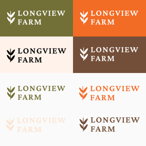
On the theme of “new looks,” our other news is that graphic designer, Emilee Waltz, developed a typographic logo, mark, and color palette specific to the Longview Gallery.
To provide some context: Emilee has been working on the branding for LVF since last year and officially launched the logo back in December. You may have seen it already on our social media pages, event flyers, or merchandise.

It has been the creative team’s intention to develop separate brands for Longview Gallery and Longview Farm, while also remaining cohesive.
The Gallery is an initiative of Longview Farm. Since the farm and gallery share both a physical space and internet space (i.e. social media platforms), it is important to distinguish between them to avoid confusion.


The Longview Gallery type logo includes a half sun icon, as opposed to the wheat commonly used in the Farm logos. The circle gallery mark is a cropped portion of the barn, which recalls the Farm’s primary logo.
The farm’s orange signals energy, joy, creativity, and good health. The gallery’s earth-toned green represents growth, renewal, and a connection to nature. They are in conversation with one another, but also distinct.
Even the slightest change to branding elements can help the audience identify if something is related to Longview Farm, Longview Gallery, or both.
______________________
Needless to say, things are happening in 2025! We’re excited about these updates (and maybe you are too).